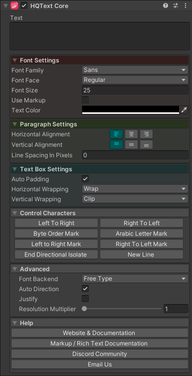
HQText Core Component
Overview
This is the core HQText component and is used to set all of the properties for the text that will be rendered. This component does not display any text in Unity. To display text another component is used, usually HQText (UGUI).
Properties
| Property | Type | Range | Default | Description |
|---|---|---|---|---|
| Text | String | The text to display. | ||
| Font Settings | ||||
| Font Family | String | The font use for the text in this component. | ||
| Font Face | String | The font face refers to the 'style' of the font. Bold, italic, etc. | ||
| Font Size | Float | 25.0 | The size in points of the text. | |
| Use Markup | Bool | False | You can use markup to format the text in this component. See more about markup here. | |
| Text Color | Color | Black | The main color of the text. | |
| Paragraph Settings | ||||
| Horizontal Alignment | Enum | Left | Where to place the text horizontally in the text box. | |
| Vertical Alignment | Enum | Top | Where to place the text vertically in the text box. | |
| Line Spacing in Pixels | Float | 0.0 | How big to set the gap between lines. If it is 0, then it will ignore it. | |
| Text Box Settings | ||||
| Auto Padding | Bool | True | Whether the padding should be calculated automatically. Set to false to manually enter padding values. | |
| Padding.Left | Float | 0.0 | How much space there should be between the left side of the text area bounds and text. | |
| Padding.Right | Float | 0.0 | How much space there should be between the right side of the text area bounds and text. | |
| Padding.Top | Float | 0.0 | How much space there should be between the top side of the text area bounds and text. | |
| Padding.Bottom | Float | 0.0 | How much space there should be between the bottom side of the text area bounds and text. | |
| Horizontal Wrapping | Enum | Wrap | Controls the text rendering when the text reaches the bounds of the text area. Options are: • Wrap - Wrap the text onto the next line.• Clip - Do not wrap the text, simply clip it to the bounds of the text box.• Expand - Show all the text even if it is beyond the bounds of the text area. | |
| Vertical Wrapping | Enum | Clip | Controls the text rendering when the text reaches the bounds of the text area. Options are: • Clip - Do not wrap the text, simply clip it to the bounds of the text box.• Expand - Show all the text even if it is beyond the bounds of the text area. | |
| Control Characters | Control characters are special characters that change how the text is rendered but aren't visible themselves. | |||
| Left to Right | Button | Left to right mark goes at the front of the string to determine directionality. | ||
| Right to Left | Button | Right to left mark goes at the front of the string to determine directionality. | ||
| Byte Order Mark | Button | Use to break Arabic letters that should join without using a space. | ||
| Arabic Letter Mark | Button | An Arabic letter mark to fool the system into thinking that there is an Arabic letter - often placed before number sequences without Arabic that should be Bidi'd to RTL. | ||
| Left to Right Mark | Button | Left to right mark control character meant to distinguish a piece of text from its surroundings. | ||
| Right to Left Mark | Button | Right to Left mark control character meant to distinguish a piece of text from its surroundings. | ||
| End Directional Isolate | Button | End Directional Isolate section. | ||
| New Line | Button | Adds a line break. | ||
| Advanced | ||||
| Font Backend | Enum | FreeType | The font rendering system to use internally. Options are: • FreeType - FreeType is an open-source library for rendering fonts.• Win32 - Uses the native Windows font renderer. | |
| Auto Direction | Bool | True | If true, the direction of the text will be calculated automatically based on the content. English, for instance, will be left-to-right, while Hebrew and Arabic characters will be right-to-left. | |
| Justify | Bool | False | If true, each line will stretch to fill the whitespace. | |
| Resolution Multiplier | Float | 1.0 | Multiply the resolution by this factor to supersample the text. |